Many photoshoots have been postponed in the middle of the COVID-19 pandemic, but product photography, which includes food, can be done safely indoors so I thought it’d be helpful to give you a look into my thought process when I styled and shot this set.
Inspiration
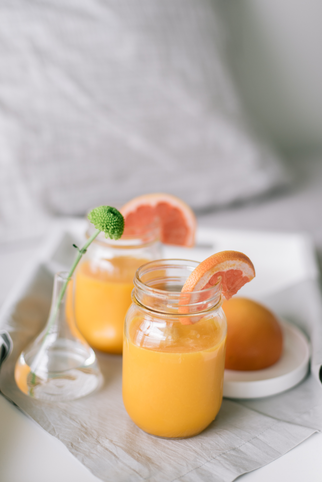
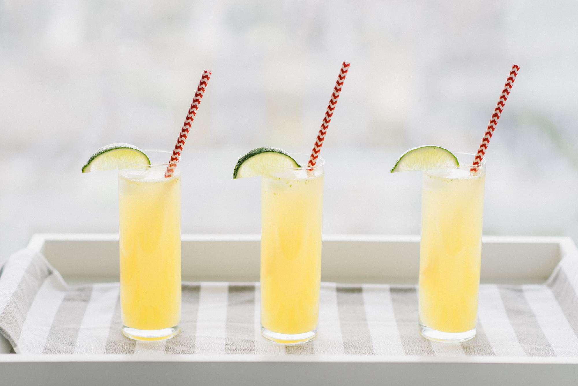
The inspiration behind this shoot was the longer, sunny days and to show a summer picnic on a blanket with a charcuterie board, refreshing drinks and a light lunch. While most people are at home during the day, it doesn’t meant that they can’t have a picnic in their backyard, on their balcony or even indoors.
Colours
The colour palette was focused on oranges, reds and neutral tones with a hint of green for freshness. Using food with warm and bright colours, the light brings out the richness of each ingredient.
Secondary props were kept neutral so they wouldn’t take the attention away from the main subject: the food.
Styling
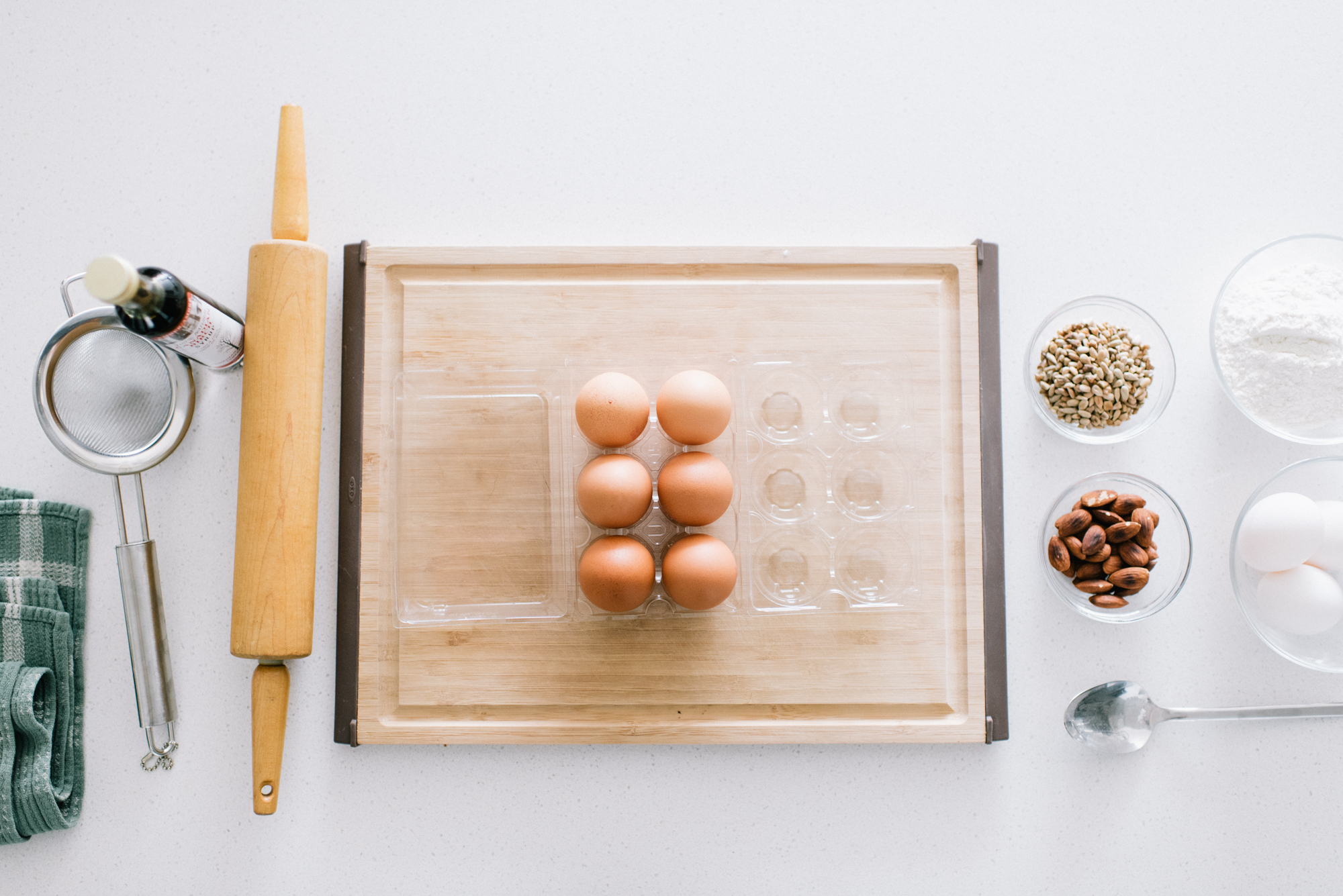
When it comes to styling, some common questions are: “How do I style props? When is it too much/little?”
It’s easy to go overboard with styling by adding an overwhelming amount of props, but it’s not always necessary. If a prop enhances the message, it can be added. If it distracts and takes away from the main subject (eg. product), remove it.
Context matters and adding anything extra (eg. props, photo filters) just to fill space or keep up with a trend can easily dilute the focus and date the photo.
Result
I hope this helped! If posts like these interest you, let me know and maybe I’ll make a series out of it. As always, feel free to ask questions!